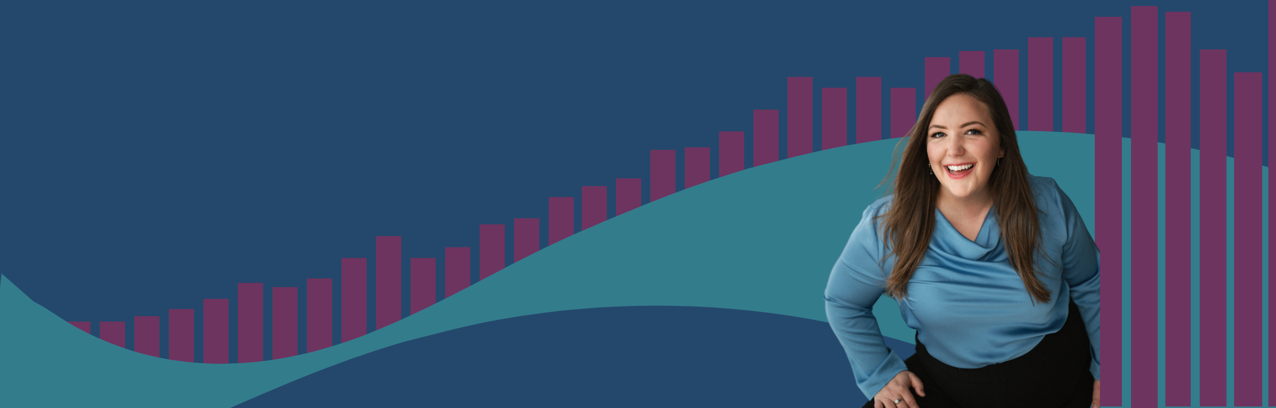
Visualizing health data can be complicated.
Let’s work together to create
meaningful health visualizations.
When I studied public health, chart design was prescriptive: lines for trends, bars for categories, and chart titles that described the metric rather than the message.
Health data deserves better, and the modern world demands more.
I work with teams to design impactful data visualizations, from static charts and slide decks to reports and interactive dashboards that enable the story-finding necessary to enable data storytelling. I apply human-centered design and agile methods to data projects, and enable organizations to do the same.
I also lead workshops and speak about data visualization, with the goal to inspire others to dive into the data viz world.
That purpose has inspired my leadership of the global Data Viz Society, with the aim to nurture, celebrate, and advance the field of data visualization.
My work is rooted in the belief the we must visualize data responsibly, considering the impact and unintended consequences of the charts we share, particularly in our AI-enabled world where meaning and trust in data requires keeping a human in the design loop.

Services
-

Workshops & Coaching
I lead webinars, workshops, and coaching engagements on data visualization design fundamentals, dashboard design, agile for data visualization, data storytelling, and responsible data visualization.
-

Design & Development
I work with clients to design and develop impactful data visualizations, reports, and dashboards that help your audience connect with your data in engaging ways. My work ranges from advisory and review services to long term collaborations on big projects.
-

Keynotes & Talks
I deliver engaging, thought provoking talks about the world of data visualization, from industry themes to responsible data visualization. Recent talks have included “Why the World Needs Dashboard Developers in an AI Enabled World” and “Making Meaningful Data Visualizations”, as well as our monthly Chart Chat livestream.
Where to find me when I’m not working with clients
Since 2019, I’ve led the global Data Visualization Society, where I’ve served on the board since our founding in 2019 and currently serve as the Executive Director.
I write about data visualization in Nightingale, as well as publications like the New York Times and Fast Company where I’ve shared my experiences with data, loss, and misinformation during the COVID-19 pandemic.
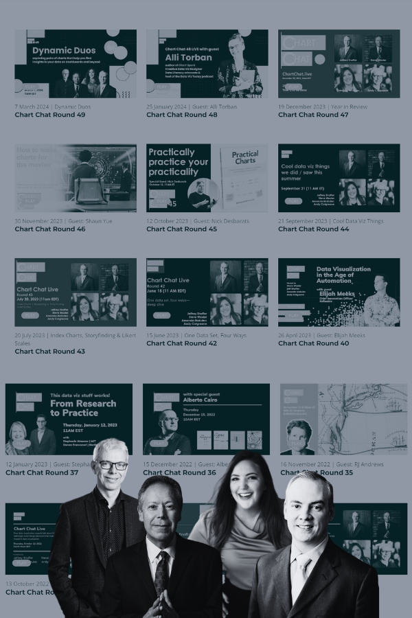
Livestreams more your cup of tea? Join us live each month on Chart Chat, hosted with the authors of the Big Book of Dashboards. We’re also working on a new book on succeeding with dashboards, expected to be published in 2025.
Check back for updates on recent recorded talks and podcast guest appearances.


Get in Touch!
What’s your biggest pain point around communicating data? I’d love to chat and see how we can collaborate on a project or how I could support your team to build their data visualization skills.